Brand & digital
WHERE STRATEGY MEETS CREATIVITY
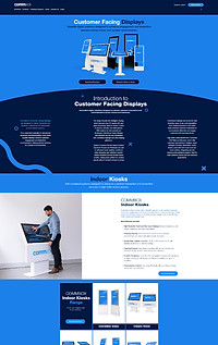
COMMBOX
As the Chief Creative Officer at CommBox, I led the redesign of both the website and branding to create a more cohesive and compelling identity. When I started, CommBox’s branding lacked consistency, so I developed a unified visual language that reflects our mission: to be the collaboration suite of choice in every space where people meet to learn and work together.
The website embodies this vision, showcasing our commitment to connected, interactive technology that enhances learning, collaboration, and engagement. By highlighting our Australian-designed products and in-house innovation, the site appeals to educators, business professionals, and industries seeking intuitive and sustainable solutions.
The user experience is crafted for seamless navigation, ensuring visitors quickly understand our product offerings and core values, making work fun, embracing a can-do attitude, striving to be the best, and being honest and authentic. Through strategic branding and web design, the CommBox identity now stands out as a leader in interactive technology.
- 2023 -


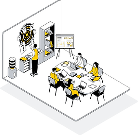
CommBox Social Content Examples
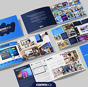
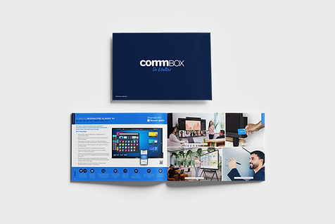
COMMBOX PRINT COLLATERAL
As Head of Creative at CommBox, I led the rebranding of our print collateral to create a more cohesive, polished, and on-brand visual identity. The redesign focused on consistency, clarity, and modern aesthetics, ensuring that every touchpoint, from brochures to catalogues, aligned seamlessly with CommBox’s innovative and professional brand image. This transformation is evident in the Business and Education Catalogues (Business | Education), where refined layouts, a bold yet clean colour palette, and dynamic imagery elevate the brand's credibility and impact.


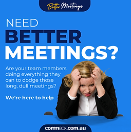
CommBox 'Better Meetings' Campaign
The "Better Meetings" campaign was designed to shake up the traditional meeting space by positioning CommBox as the ultimate solution for engaging, efficient, and interactive collaboration. With bold, high-impact messaging like "Bye Bye Boring", the campaign directly addressed workplace pain points—unproductive meetings and outdated tech.
Through a mix of digital content, social ads, and event branding, we highlighted how CommBox’s touchscreen technology transforms meetings into dynamic, results-driven experiences. The visual identity, featuring vibrant graphics, engaging typography, and playful yet professional elements, made the campaign both eye-catching and memorable, reinforcing CommBox as the leader in modern workplace solutions.

Integrate Trade Show Custom Stand 2024 - Back View


Integrate Trade Show Custom Stand 2024 - Front View


Better Meetings Social Content Example
CommBox Van Wrap
A cohesive van wrap turns every drive into a moving billboard, reinforcing brand recognition everywhere. These designs keep CommBox's identity bold, professional, and instantly recognisable, ensuring the brand stands out, even in traffic.


Reziio
- 2019 -
As the Chief Creative Officer behind Reziio's digital presence, I led the website design and branding to reflect the company's innovative approach to smart residential technology.
This branding reinforces Reziio’s mission: creating intuitive, cost-effective retrofit solutions that empower buildings and their residents. The website design extends this vision, blending clean, modern aesthetics with a seamless user experience, ensuring visitors can effortlessly explore Reziio’s offerings and future-focused approach.


The Reziio logo is more than just a name, it embodies a philosophy. "Resident of Earth" speaks to sustainability and our place in a connected world, while the two ii symbols mirror digital evolution, resembling the familiar // found in coding and technology.
ZARA
USER EXPERIENCE /
AI SMART MIRROR
The concept was designed around the idea of transforming the traditional fitting room into a seamless AI-driven styling experience. Using smart mirror technology, the system scans the customer and instantly generates realistic outfit visualisations using Zara’s latest seasonal collections. The experience removes friction from the shopping journey while introducing a more immersive and personalised form of retail interaction.
Visually, the direction was intentionally minimal and premium to align with Zara’s existing brand language. Neutral colour palettes, clean typography, subtle UI overlays, and refined environments were used to ensure the technology feels sophisticated rather than overly futuristic. The mirror interface was designed to feel almost invisible, allowing the fashion and customer transformation to remain the focal point.
The concept also explores the emotional side of retail innovation. Rather than simply browsing clothing racks, customers can instantly visualise aspirational versions of themselves styled in complete looks, including accessories and seasonal outfit combinations. This creates a more engaging and confidence-driven shopping experience while encouraging exploration across multiple styles and collections.
The user journey was designed to be frictionless. Once a customer finds a look they like, a QR code can be scanned directly from the mirror interface, automatically adding the selected items to their Zara account and shopping cart. This bridges the gap between physical retail, digital commerce, and AI personalisation in a way that feels intuitive and highly scalable.
The concept was developed to work across women’s, men’s, and children’s fashion categories, allowing the innovation to function as a unified retail ecosystem rather than a single-use activation. The visual executions demonstrate how the technology could adapt to different demographics while maintaining a cohesive premium brand experience.
Overall, the direction positions Zara as a future-focused fashion retailer that blends AI innovation, personalised styling, and seamless omnichannel shopping into a single elevated customer experience.


Mount Franklin
"The Nation’s Hydration" Ad Campaign
For Mount Franklin’s "The Nation’s Hydration" campaign, I created a sleek 3D water animation using Adobe Illustrator and After Effects. The realistic water effects flow seamlessly over the typography, bringing hydration to life in a refreshing, immersive way.
Set against a crisp blue gradient, the dynamic liquid motion reinforces Mount Franklin’s purity and freshness, making this campaign a visual celebration of hydration.
Studio 10
"Colourful People, Colourful Lives" LGBTQ+ Segment Transition
For Network Ten’s Studio 10, I designed a custom animated transition for their LGBTQ+ segment, "Colourful People, Colourful Lives."
Using Adobe After Effects, I animated bold, gradient typography transitioning into flowing rainbow arcs—symbolising inclusivity, joy, and self-expression. Set against a deep midnight blue background, the colours pop, ensuring a sleek, celebratory feel.
This high-energy transition reinforces Studio 10’s commitment to representation and inclusivity on Australian morning television.


