PRINT / ADVERTISING
PRINT THAT DEMANDS ATTENTION. ADS THAT DRIVE IMPACT

Dyson Vacuum Campaign


OBJECTIVE
The goal was to position Dyson's Cyclone and V-series cordless vacuums as the ultimate force against dirt, dust, and debris. The campaign needed to visually communicate Dyson’s superior suction power in a bold, cinematic, and engaging way while making it instantly memorable.
EXECUTION
Using dramatic, high-energy visuals, each ad tells a story of Dyson's dominance over messes. The “Grit Reaper” ad gives a supernatural edge, making dirt’s fate inevitable. “Dyson vs. Sand” leans into a battle metaphor, reinforcing that Dyson always wins. “Dust Vortex” amplifies the brand’s advanced suction technology, drawing parallels to black hole-level force.
RESULTS
The ads deliver a striking, sci-fi-inspired aesthetic with dynamic motion, glowing accents, and exaggerated physics, making Dyson’s power feel almost mythical. The campaign blends humour, intensity, and Dyson’s sleek design, ensuring maximum impact across digital and print platforms.


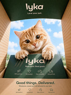


LYKA - FRESH PET FOOD
“Too Irresistible”


This campaign was built around a simple behavioural insight: when pets truly love something, restraint disappears. Dogs chew through boxes. Cats claw their way in. It’s a behaviour pet owners instantly recognise because it feels authentic, familiar, and emotionally true.
Rather than advertising pet food in a polished or clinical way, the creative direction focused on using the pets’ reactions as proof of product quality. The damaged Lyka boxes become visual evidence that the food inside is genuinely irresistible, turning the packaging itself into part of the storytelling.
Visually, the campaign uses minimal layouts, premium negative space, and clean typography to align with Lyka’s elevated direct-to-consumer aesthetic. This restraint allows the humour and personality of the animals to become the focal point, creating a balance between premium branding and playful chaos.
The campaign was designed as a flexible creative platform across social, digital, print, and outdoor. The central visual idea, pets destroying packaging to get to the food, allows for endless variations while maintaining strong brand consistency. Humorous copy lines such as “Fresh food > self control” reinforce the playful tone without compromising the premium positioning.
Overall, the direction aims to position Lyka as premium yet approachable, emotionally connected to real pet-owner behaviour, and distinct within a category saturated with generic pet food advertising.
SMIGGLE Ad CAMPAIGN


The print direction uses oversized typography, bold colour blocking, and playful character illustration to create an instantly recognisable visual identity. The exaggerated expressions and vibrant palette were designed to capture the high-energy personality of the Smiggle brand while appealing directly to children’s sense of fun, creativity, and collectability. The layouts intentionally feel loud, playful, and impossible to ignore, reflecting the excitement kids associate with the brand.
The packaging direction transforms everyday school products into expressive lifestyle accessories. Bright colours, character-driven graphics, and playful product naming were used to make the items feel collectible and emotionally engaging rather than purely functional. The consistent visual system across lunchboxes, bags, and accessories creates strong shelf presence while reinforcing Smiggle’s fun-first brand identity across every touchpoint.
The experiential direction focused on turning the Smiggle brand into an immersive, interactive world. Using oversized graphics, playful environments, vibrant colour zoning, and activity-based touchpoints, the exhibition space was designed to feel energetic, memorable, and highly shareable. The environment encourages exploration and interaction, creating a branded experience that extends beyond retail and allows customers to physically step inside the playful universe of Smiggle.
SMIGGLE Ad CAMPAIGN
The print direction uses oversized typography, bold colour blocking, and playful character illustration to create an instantly recognisable visual identity. The exaggerated expressions and vibrant palette were designed to capture the high-energy personality of the Smiggle brand while appealing directly to children’s sense of fun, creativity, and collectability. The layouts intentionally feel loud, playful, and impossible to ignore, reflecting the excitement kids associate with the brand.
The packaging direction transforms everyday school products into expressive lifestyle accessories. Bright colours, character-driven graphics, and playful product naming were used to make the items feel collectible and emotionally engaging rather than purely functional. The consistent visual system across lunchboxes, bags, and accessories creates strong shelf presence while reinforcing Smiggle’s fun-first brand identity across every touchpoint.
The experiential direction focused on turning the Smiggle brand into an immersive, interactive world. Using oversized graphics, playful environments, vibrant colour zoning, and activity-based touchpoints, the exhibition space was designed to feel energetic, memorable, and highly shareable. The environment encourages exploration and interaction, creating a branded experience that extends beyond retail and allows customers to physically step inside the playful universe of Smiggle.