COMMBOX
As the Chief Creative Officer at CommBox, I led the redesign of both the website and branding to create a more cohesive and compelling identity. When I started, CommBox’s branding lacked consistency, so I developed a unified visual language that reflects our mission: to be the collaboration suite of choice in every space where people meet to learn and work together.
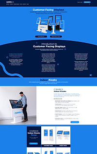
The website embodies this vision, showcasing our commitment to connected, interactive technology that enhances learning, collaboration, and engagement. By highlighting our Australian-designed products and in-house innovation, the site appeals to educators, business professionals, and industries seeking intuitive and sustainable solutions.
The user experience is crafted for seamless navigation, ensuring visitors quickly understand our product offerings and core values, making work fun, embracing a can-do attitude, striving to be the best, and being honest and authentic. Through strategic branding and web design, the CommBox identity now stands out as a leader in interactive technology.
- 2023 -





CommBox Social Content Examples
COMMBOX PRINT COLLATERAL
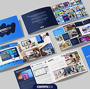
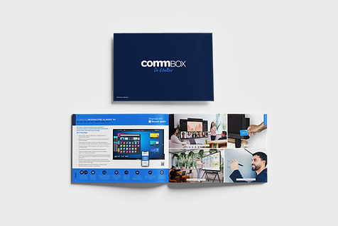
As Head of Creative at CommBox, I led the rebranding of our print collateral to create a more cohesive, polished, and on-brand visual identity. The redesign focused on consistency, clarity, and modern aesthetics, ensuring that every touchpoint, from brochures to catalogues, aligned seamlessly with CommBox’s innovative and professional brand image. This transformation is evident in the Business and Education Catalogues (Business | Education), where refined layouts, a bold yet clean colour palette, and dynamic imagery elevate the brand's credibility and impact.


CommBox 'Better Meetings' Campaign
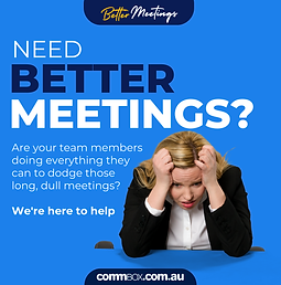
The "Better Meetings" campaign was designed to shake up the traditional meeting space by positioning CommBox as the ultimate solution for engaging, efficient, and interactive collaboration. With bold, high-impact messaging like "Bye Bye Boring", the campaign directly addressed workplace pain points—unproductive meetings and outdated tech.
Through a mix of digital content, social ads, and event branding, we highlighted how CommBox’s touchscreen technology transforms meetings into dynamic, results-driven experiences. The visual identity, featuring vibrant graphics, engaging typography, and playful yet professional elements, made the campaign both eye-catching and memorable, reinforcing CommBox as the leader in modern workplace solutions.

Integrate Trade Show Custom Stand 2024 - Back View


Integrate Trade Show Custom Stand 2024 - Front View



Better Meetings Social Content Example
CommBox Van Wrap
A cohesive van wrap turns every drive into a moving billboard, reinforcing brand recognition everywhere. These designs keep CommBox's identity bold, professional, and instantly recognisable, ensuring the brand stands out, even in traffic.


